Conceptual website design
FLYUX
Timeline
July 2021
Role
UX/UI Designer, branding design
The team
1 Product Designer (me)
Redefining air travel with seamless booking experiences
Fly UX an airline startup, driven by a singular vision: to transform the booking experience for travelers. Rooted in a deep commitment to user-centric design principles, Fly UX aims to alleviate the frustrations commonly associated with flight booking applications and to set a new standard for customer satisfaction and convenience in the airline industry.
Problem
Most flight booking platforms are difficult to navigate and aggravate users
Fly UX is a start-up airline that wanted to provide users with a stress-free booking experience. This is a conceptual project based on my 6 months long UX Design Institute course.
Goal
Creating a stress-free booking experience
The goal was to understand the pain points of existing flight booking applications, identifying user needs and preferences, and designing intuitive interfaces that streamline the booking process. The ultimate objective is to create a solution that enhances user satisfaction and encourages repeat usage of the Fly UX platform.
(1) Research
Identifying pain points and what can be improved in the fligh booking process
The research stage involved gathering information about competitors and users. Research methods I used for this study included competitive benchmarking, usability testing, and note-taking.
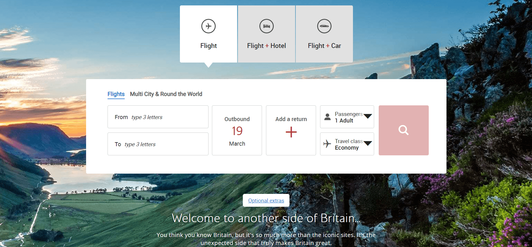
Competitive analysis
Insights from EasyJet, British Airways, Emirates airline, and Eurowings
As part of my competitor analysis, I examined four different popular competitors: EasyJet, British Airways, Emirates Airline, and Eurowings. In doing so, I discovered how they operate, what they did right, what pitfalls they failed to avoid and which conventions I should apply to my own prototype.
Key Takeways
progress indicators help users avoid frustration and successfully complete a task.
simplified forms lead to a better experience, it gets easier moving from “booking” to “check in” to “my trip”.
remove unnecessary information and give a strong CTA button for booking flights on home screen.
the payment screen should show the flight details, to give a better sense of what users are paying for.
5
3
4
2
1
1
Main navigation is well organized and minimal.
2
When booking a flight user can choose to book a hotel or rent a car as well, which reduces steps. Flight option is already selected.
3
Due to its size, "Search Flight" is the main focus of the homepage. The section includes all the necessary information for the user to start booking a flight.
4
Search button is inactive due to fields not being completed. Users are prompted to complete all fields to continue.
5
Text is hard to read because of the background
Usability Testing
Comparing airline eebsite designs: an analysis of aeroflot and easyJet
The next step was to find out how different airlines approached the same problem. I choose to use two websites: Aeroflot and EasyJet to understand if their design is intuitive, easy to use and if there are any usability problems.
Note-taking
Feedback and suggestions for flight booking interface
“Straightaway I can see my date is available and the price, without having to go look any further” - User is happy with the provided information.
"A more stand out color" should be used to accentuate the Search Flight button on the homepage screen.
User didn't like the fact that when they clicked on the seat option "it didn't prompt me to choose".
Key Takeways
Less actions on a page simplifies a complex process.
Use smart data wherever possible (geolocation, language, currency etc).
Don’t force users to register/log in, give them the option to book a flight as a guest.
Calendar pop-up is easier to use than typing manually the date.
An excessive amount of information or options on the home screen overwhelm users.
(2) Analysis
Organizing Insights through Affinity Diagrams, Customer Journeys, and User Flows
Customer Journey Map
Analyzing user reactions and emotions step-by-step
In the next step, I created a step by step view of the booking process using the customer journey map to clearly see the user’s reactions and emotions and to understand which areas impacted user the most.
Key Takeways
Displaying offers etc on the homepage should be avoided and the main features should be highlighted.
Layout and input areas should be kept short and clear.
Flight summary should contain everything a user needs to know.
Don’t show unavailable options.
Use strong primary colours to attract user’s attention where needed.
books directly with airline
website
uses aggregator websites
compare flight prices
searches for cheapest flight
user dislike cluttered homepage
ads that take up most of the
screen
“Search Flight” CTA is not
visible enough
some of the options on the
search bar are hidden
the search bar is the main focus
of the homepage
most of the options you need to
book a flight are on homepage
strong primary colors to attract
user’s where needed
fewer options for search bar
are easier to find
showing other flights either side
of the specified date
calendar option to select dates
“is easy to navigate”
easy to differentiate fare types
and their benefits
clear visual differentiation
between fare types
clear and simple page, easy to
add passengers
users like +/- hoppers to add
passenger numbers
the option to skip the choosing
seats page
clear color code seats
differentiation
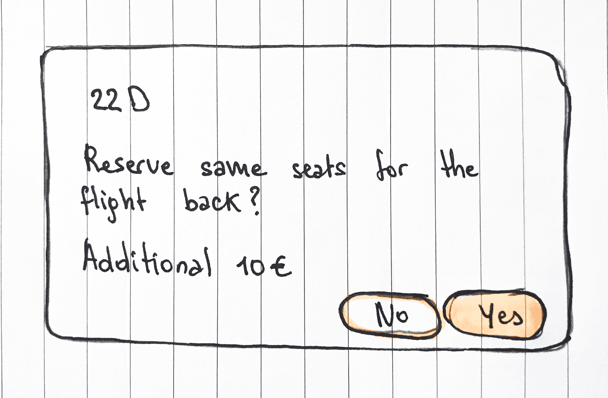
the option to select the same
seat for the return flight
share with friends option
the layout and input areas
were clear
flight details clearly displayed
all flight details in one screen
lock price is useful for the
users at the decision phase
the summary of the flight
contains everything a user
needs to know
the boxes for dates said
“outgoing/ return flight” instead
of suggesting to input dates
the arrival time is under the
return date, it can lead to
mistakes
it’s difficult to compare fare
types when they appear
vertically
“Speedy boarding” is not an
advantage for the user
user didn’t like being shown
unavailable options
an entire screen dedicated to
choosing passengers creates
extra steps
user had to scroll up and down
to pick a seat for each
passenger
user didn’t like the seat option
“it didn’t prompt me to choose”
user had to scroll up and down
to pick a seat for each
passenger
passenger total cost not
shown clearly
price shown per person rather
than total price
user doesn’t like the “basket”
section because there is too
much information
not being able to see fare
selection in summary
users tend to add the date
using the pop-up calendar
rather than type in manually
most users chose the cheapest
fare
fill required information
user skipped this section
fill required information
check the flight details prior
to booking
baggage allowance is the main
benefit that users are looking
for
user prefers to use add button
rather than type in manually
user chose window seat
check the final price
pay the ticket
user shares the flight summary
booking a flight
check flight availability
check prices
User expected the search bar
to be bigger
user expected the “Book” CTA
to be more visible
user expected the for the airline
website to locate automatically
User expected to see other
available times for the chosen
date
user expected date format to
be displayed instead of
outbound/ return text
User is familiar to a specific
language to represent each
fare type
when choosing flight user
expected the search bar to
include how many passengers
to add
choose the cheapest seat
user likes window or aisle
seat
user is familiar to payment
pages and enters easily
personal information.
user expected to find a
summary breakdown before
paying
select departure and return
date
choose suitable fare
compare fare benefits and
prices
add passengers
choose a seat
get a seat near the window
extra legroom
find the cheapest option
type-in passenger info
finalise the booking
book the flight
review trip details
make changes if neccessary
know the total price
STEPS
GOALS
MENTAL MODELS
BEHAVIOUR
PAIN POINTS
POSITIVE
HOMEPAGE
DATE SELECTION
FARE SELECTION
PASSENGERS
SEAT SELECTION
PAYMENT
SUMMARY
Customer
thoughts & feelings


“The booking section is
nice and big”
The calendar “was easy to navigate” -
it shows the whole month
“Why tell me if I can’t
have it”
“There’s little people -
I reckon”
“It didn’t prompt me to
choose”
“A bunch of text I don’t
want to read”
User Flow
Defining user paths for comprehensive design
Before entering the design phase, I created a user flow diagram in order to define the complete path a user takes when booking a flight starting from the entry point right to the final interaction.
This allowed me to evaluate what should be included in the next stage in my design process and also to ensure that the final product covers all the required steps.

(3) Design
Identifying design solutions, I sketched navigation, then created high-fidelity prototypes in Figma
Sketches
Sketching screens for seamless booking experience
I sketched individual screens to define how each element would function, how the user will interact with them and what information is required for each stage of the booking process.
Prototyping
Crafting comprehensive designs for testing
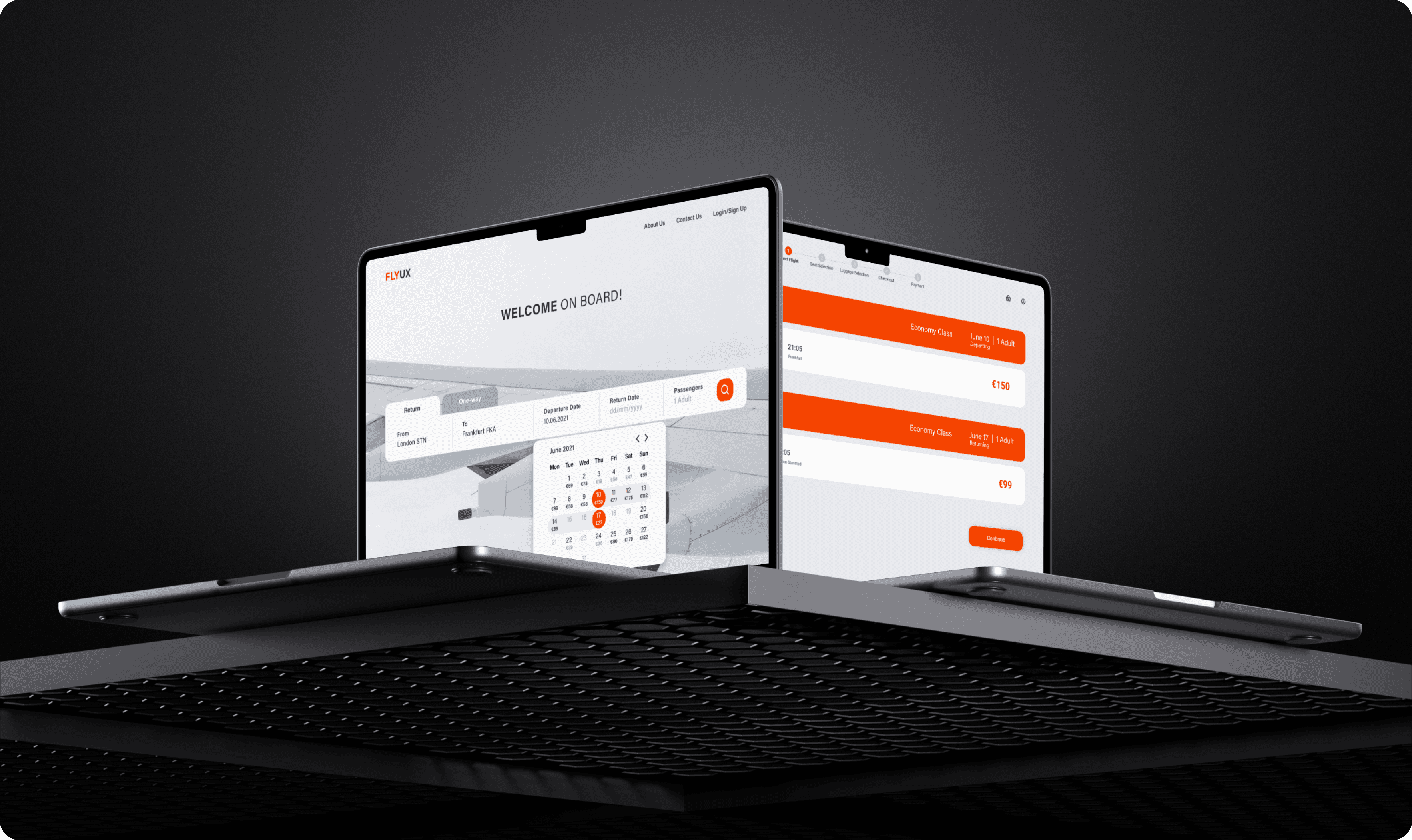
The most challenging part of my project was incorporating my ideas into a prototype that included all of the necessary details and interactions to test the high-level flow, layout, text, and interactions. You can view my prototype in the video below.
Solution
Revolutionising flight booking with
Fly UX
Fly UX solution focuses on empathizing with users to identify their pain points, needs, and preferences. By conducting user research and usability testing, I gained insights into what users value most in their booking experience. Leveraging this understanding, I designed an intuitive interfaces that simplify the booking process, prioritizing clarity and efficiency.

About Us
Contact Us
Login/Sign Up
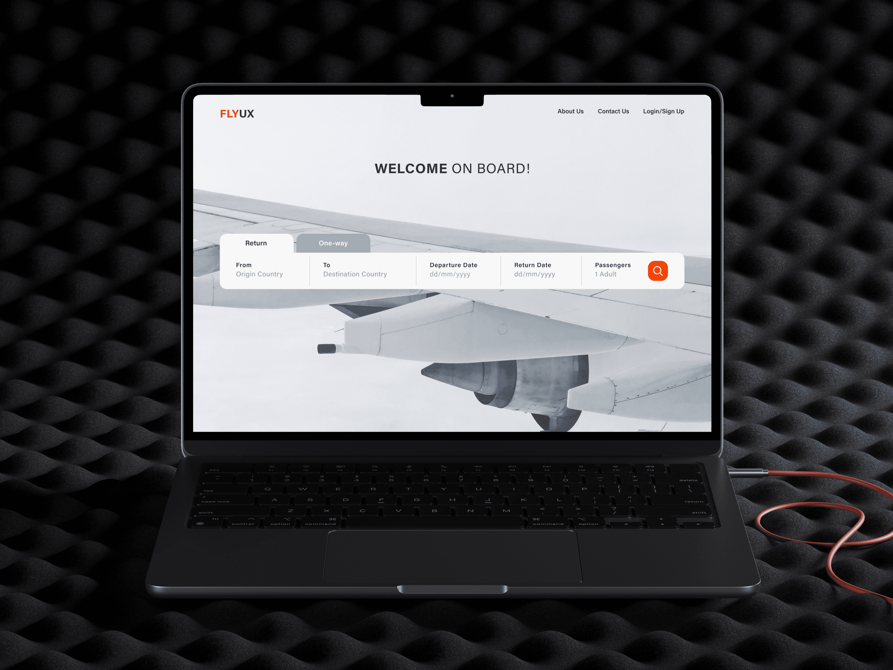
FLYUX
One-way
Origin Country
From
Destination Country
To
dd/mm/yyyy
Departure Date
dd/mm/yyyy
Return Date
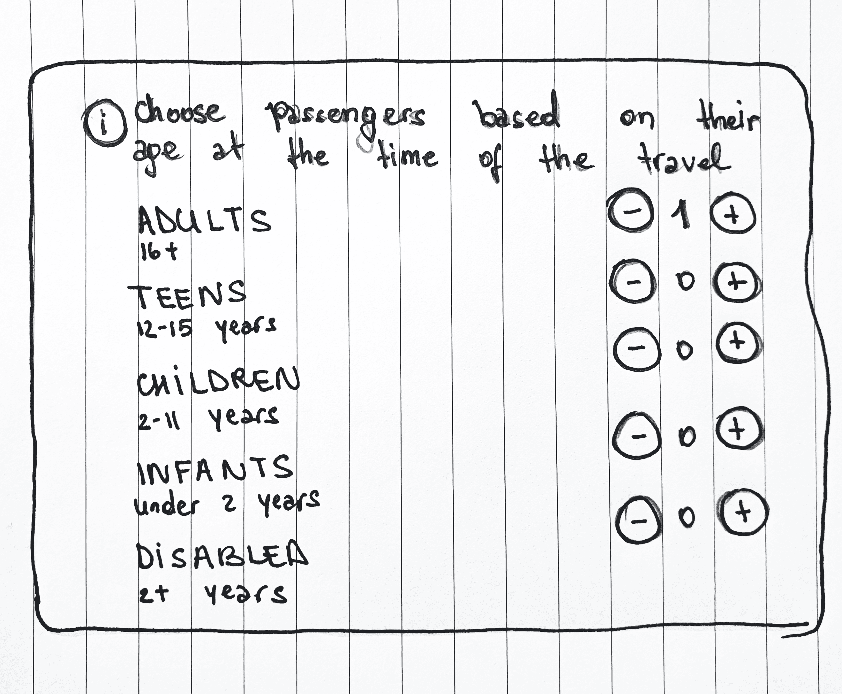
1 Adult
Passengers
Return
WELCOME ON BOARD!
When user select one deselects the other one.
By clicking “From” field a list of the departing countries appear.
Date format is shown to make it clear that it is a date field. When clicked a pop-up calendar appears to select the dates.

About Us
Contact Us
Login/Sign Up
FLYUX
One-way
Origin Country
From
Destination Country
To
dd/mm/yyyy
Departure Date
dd/mm/yyyy
Return Date
1 Adult
Passengers
Return
WELCOME ON BOARD!
Clear Selection
Origin Country
France
Serbia
Spain
Sweden
Switzerland
Turkey
United Kingdom
Germany
Greece
Pick an airport
All Airports
London Stansted
London Luton
Italy
Malta
Montenegro
If user makes a mistake the “Clear Selection” gives option to choose again the Origin Country and Airport.
The selected option is highlighted

About Us
Contact Us
Login/Sign Up
FLYUX
One-way
London STN
From
Frankfurt FKA
To
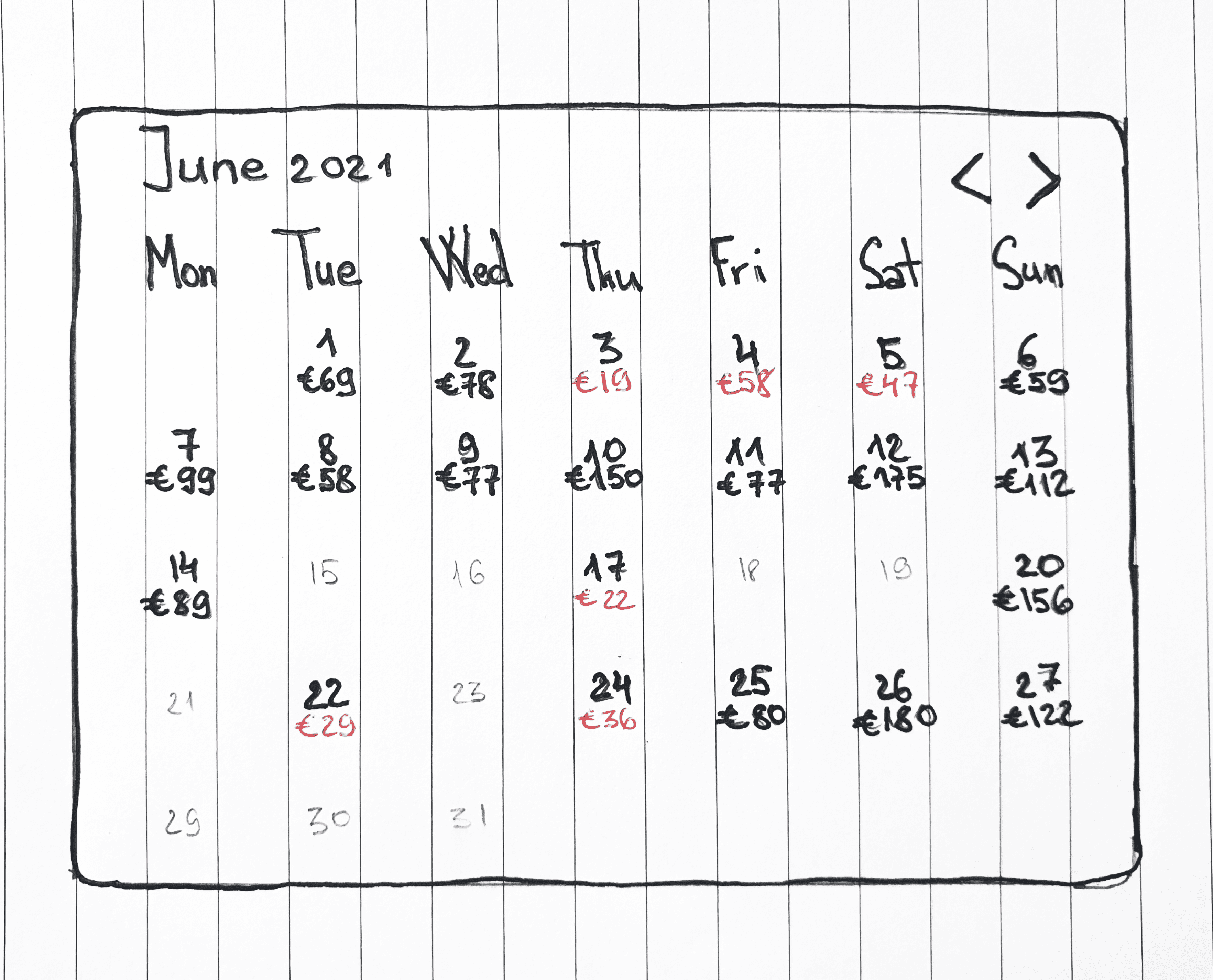
10.06.2021
Departure Date
dd/mm/yyyy
Return Date
1 Adult
Passengers
Return
WELCOME ON BOARD!
€99
7
€89
14
€69
1
€58
8
€29
22
€58
4
€77
11
€80
25
€78
2
€58
9
€47
5
€175
12
€179
26
€19
3
€22
17
€36
24
€59
6
€112
13
€156
20
€122
27
€150
10
Mon
Tue
Wed
Thu
Fri
Sat
Sun
June 2021
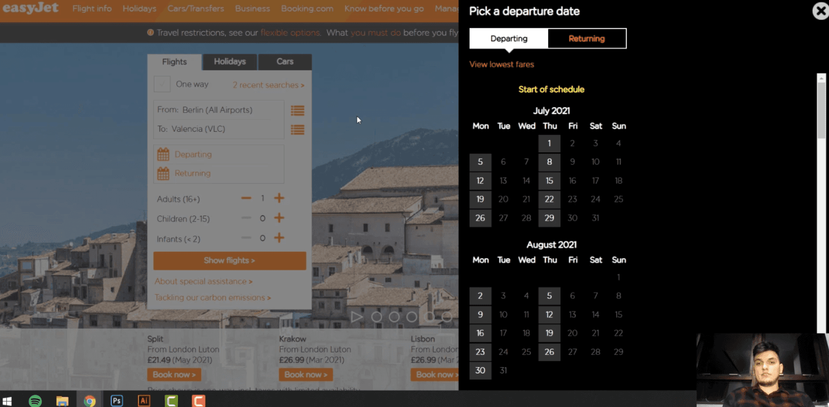
Chosen dates for the Outbound and Return flight are highlighted.
The actual month is preselected.
By clicking, user can select future or past months.
The lowest prices are highlighted so it is easier for the user to spot them.
Available dates are accentuated.
Unavailable dates are displayed in light grey.
User clicks “Departure Date” field, the cursor is blinking to start typing and also a calendar popo-up appears
Takeaways
Designing with empathy: lessons from user engagement
Throughout the project's hurdles, I gained invaluable lessons, particularly during the research phase. Engaging in depth interviews and usability tests unveiled intriguing insights I might have overlooked otherwise. Interacting directly with real users underscored the importance of designing with their needs in mind. This served as a reminder to maintain objectivity and approach the process with an open mind, recognizing that I am not the end user.